Case Study
Rebranding Scrap Connection for scalability
Summary
While working on the product at Scrap Connection, the potential to grow it beyond the scrap industry became apparent. But, that meant that the name "Scrap Connection" was limiting.
Client
Scrap Connection / Tradefox
Year
2018-2019
My role
Logo design, typography, and print paraphernalia
We began thinking of a name that would describe the nature of the product - full of data, informing decision making, saving money.
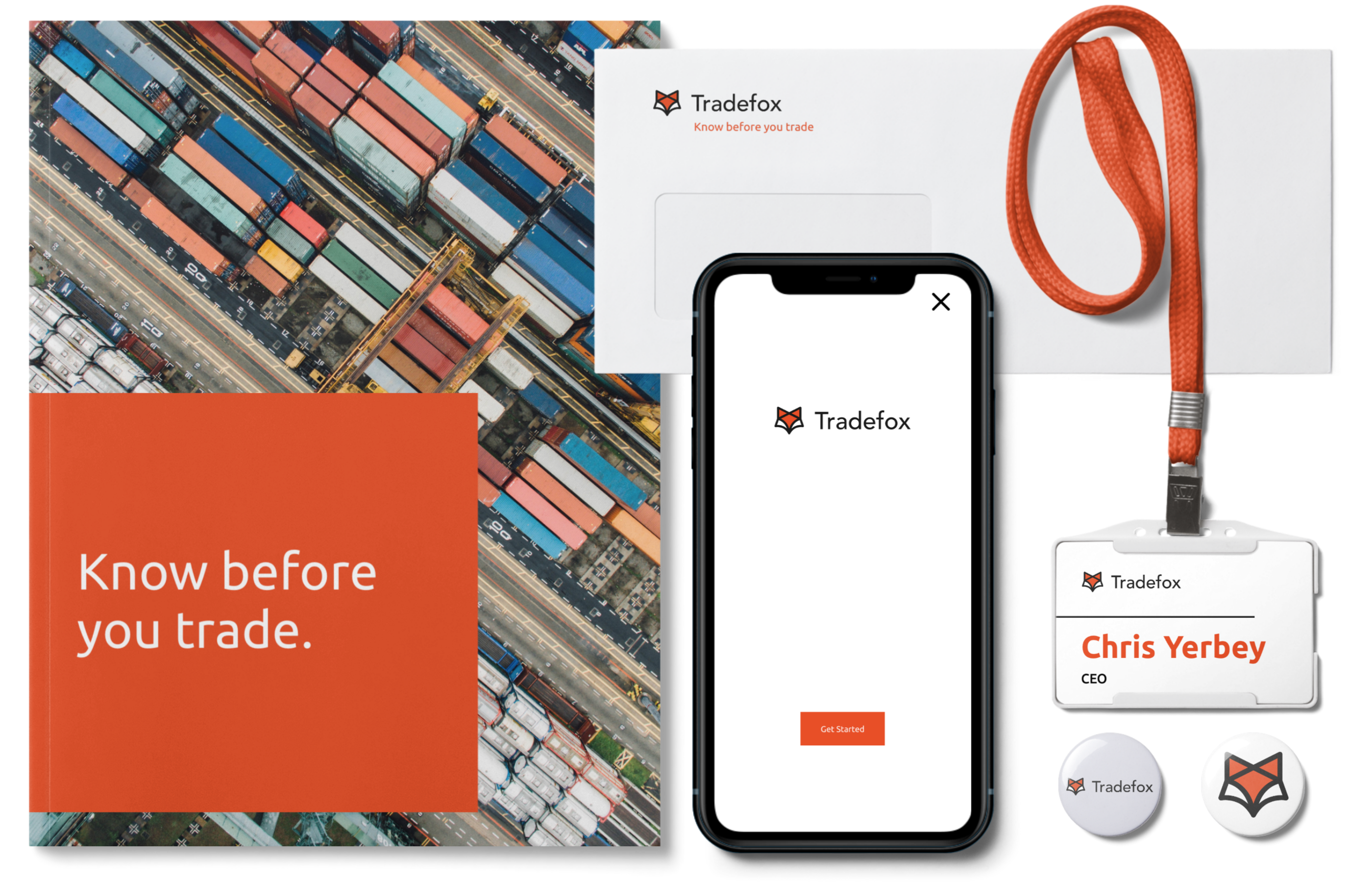
The motif of a fox indicated cleverness and quick decision making, and thus, Tradefox was born.
Thinking of trade routes, the global impact of the recyclables industry, and the fox motif, I set to work ideating on this imagery.
Result
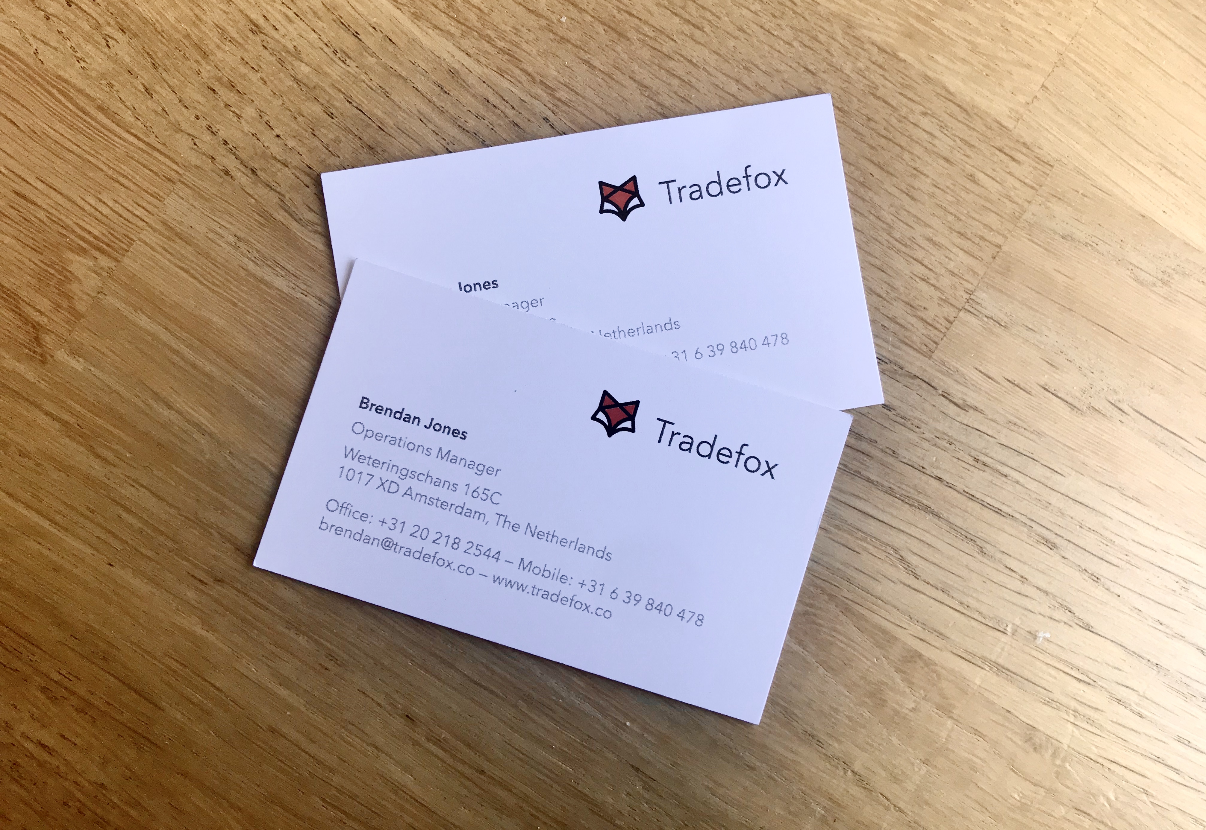
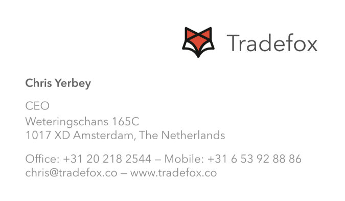
After lots of ideation, I arrived at a logo the team loved that didn't confine them to a single trade industry — a fox head constructed out of trade routes, with a bright eye-catching orange-and-black combo. The logotype is set in Avenir Medium.

Iterations & process
Thanks for stopping by.
© Elena Scherer 2024 · Beaming through the internet to you from Haarlem, Nederland