CASE STUDY
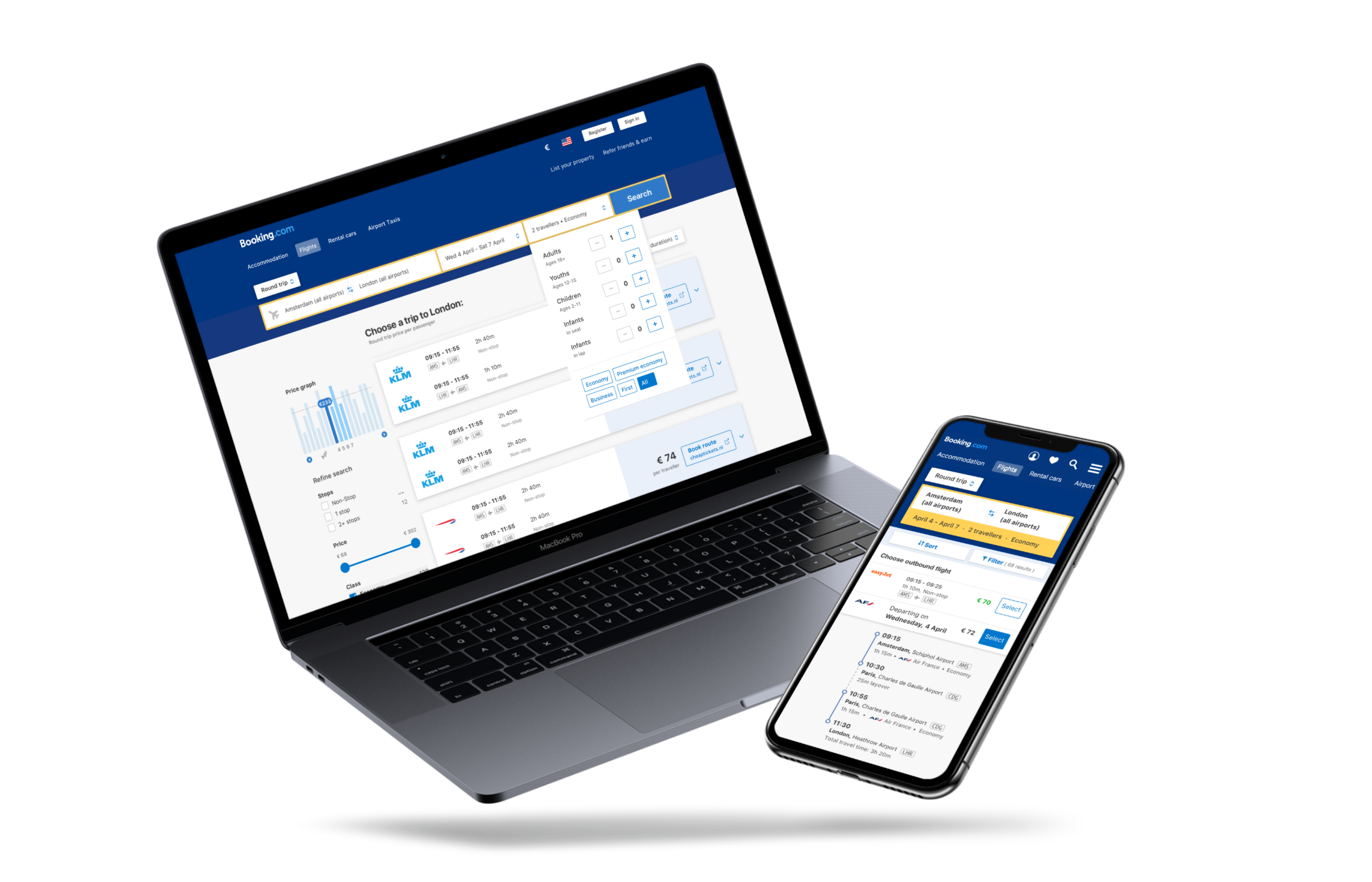
Intuitive flight search for Booking.com
Summary
Booking.com is well-known for its hotel search, but has begun to expand their offerings to fill rest of people's time while traveling.
To create the site's first flight search experience, I led research & design while managing an agile team.
For
Booking.com
Year
2018-2019
My role
UX Designer and team lead. I was responsible for planning and running user research, prototyping and interaction design,
Initial research
We sought to understand how people researched and purchased a flight, to then tailor our search experience to what they expected. We conducted several rounds of user testing, including street testing, internal and external surveys, testing with customer service executives, and finally, testing a prototype and live site with users.
In initial surveys, we asked a slew of questions based on the last flight they booked: which research tools (if any) they used, how they began their search, if their dates were flexible (and if they stuck to their original dates), etc.

These themes surfaced no matter who we asked about their search process:
- Flights are usually booked first when planning a trip. We tucked this information away for later, when we planned to work on travel packages.
- Travelers prefer to book flights directly with the airline.
- The top three decision-making factors were:
- Price
- Number of stops (direct flights preferred)
- Departure time (not everyone likes early-morning treks to the airport!)
- Price
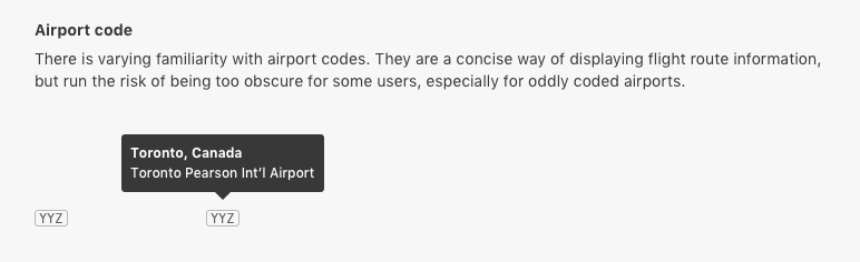
One thing that surprised me was that many travelers had little familiarity with airport codes. These are everywhere in flight searches, especially on mobile websites and apps. I specified that every airport code should be accompanied with the expanded airport name in some way.
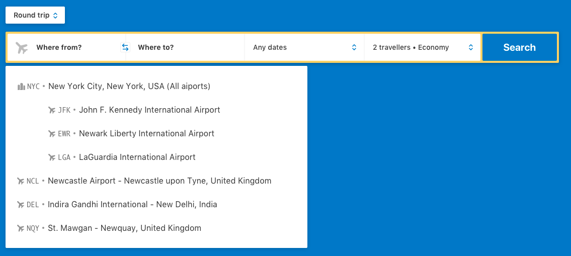
The autocomplete dropdown for the searchbox included the airport code and the full airport name
Prototype #1: Building your trip
We built a prototype based on these initial findings to start testing with customers. The priority order of the search results and filters was based on what people said their deciding factors were — price, direct flights, and departure time. Often, they would check the "Non-Stop" filter immediately after searching, and then order by price.
In this first prototype, we allowed them to select flights one at a time, instead of showing the whole round-trip information, potentially overloading them.
After selecting one flight, it was pinned to the top of their search results, allowing them to pick the next leg of their journey.
Once they'd selected both their outgoing and return flights, we showed a summary of their entire itinerary, with a link to book the flight.
While many of the younger participants picked up on the "build-your-itinerary" pattern quickly, and liked that you could see which parts of the trip were more expensive, most users overall found it too "jumpy" — if you wanted to change your flight, you had to go back to previous screens and redo your trip build.
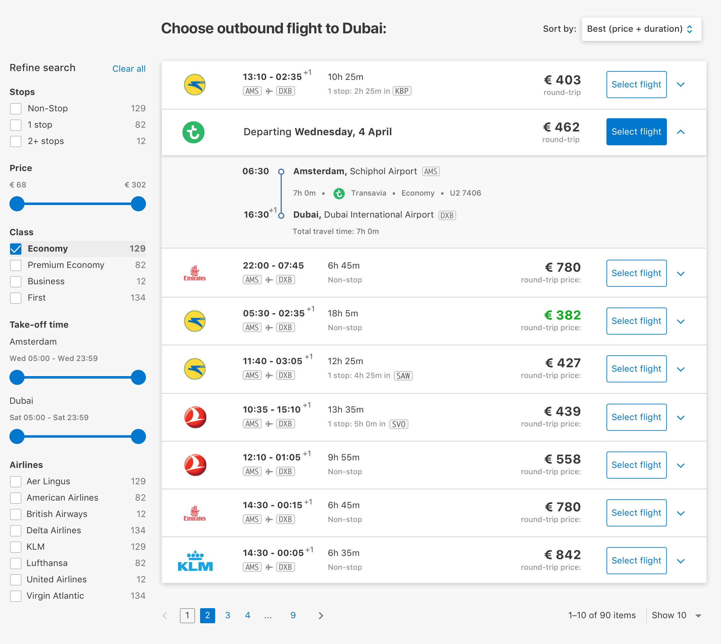
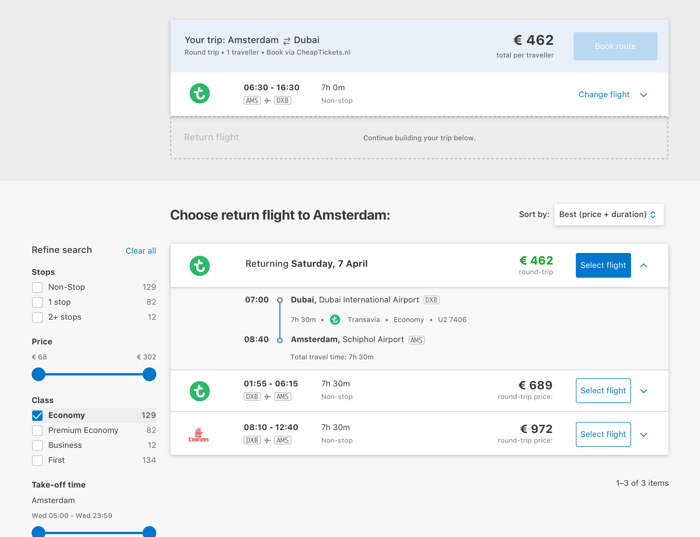
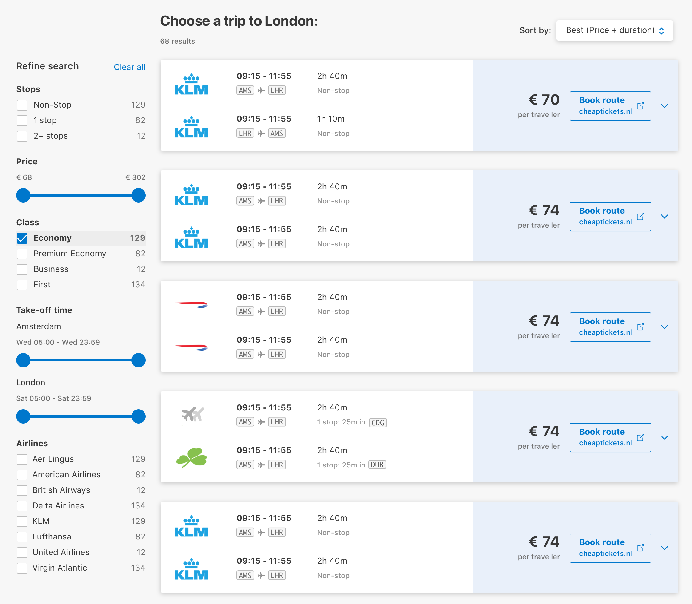
Prototype #2: Choose a round trip
So selecting flights one at a time was fine for some, but not for most.
From our initial research, we had discovered that many people used Skyscanner to research prices and available flights. It's possible that since they were used to that interface, they wanted to see the price of the whole trip in one go.
I built a new design for selecting a round trip, all at once.
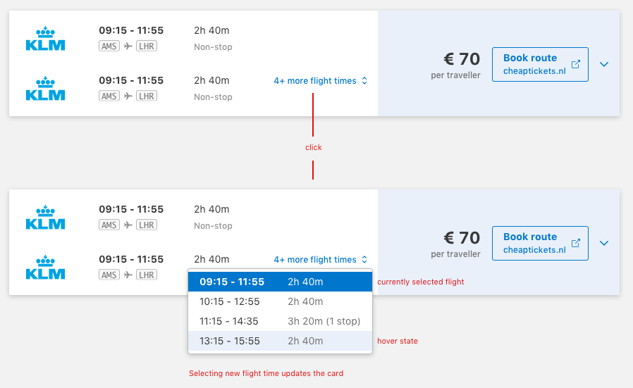
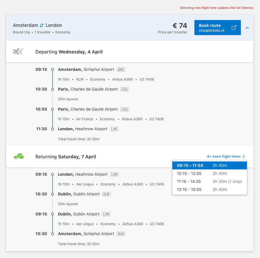
Multiple flight times for popular routes
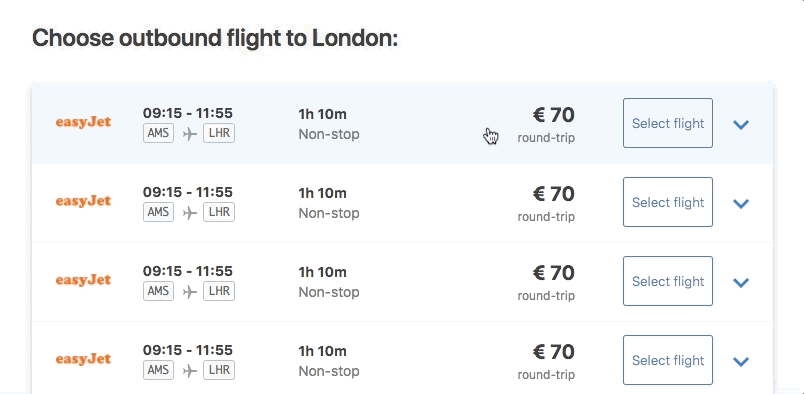
Another detail I had to design for in this new format was the possibility that an airline could have multiple flight times available for a particular route.
For example, KLM has quite a few flights from Amsterdam to London daily — instead of showing a ton of results with every possible combination, a selector to switch between available flight times would allow more itinerary customization without breaking the familiar pattern of the roundtrip search result.
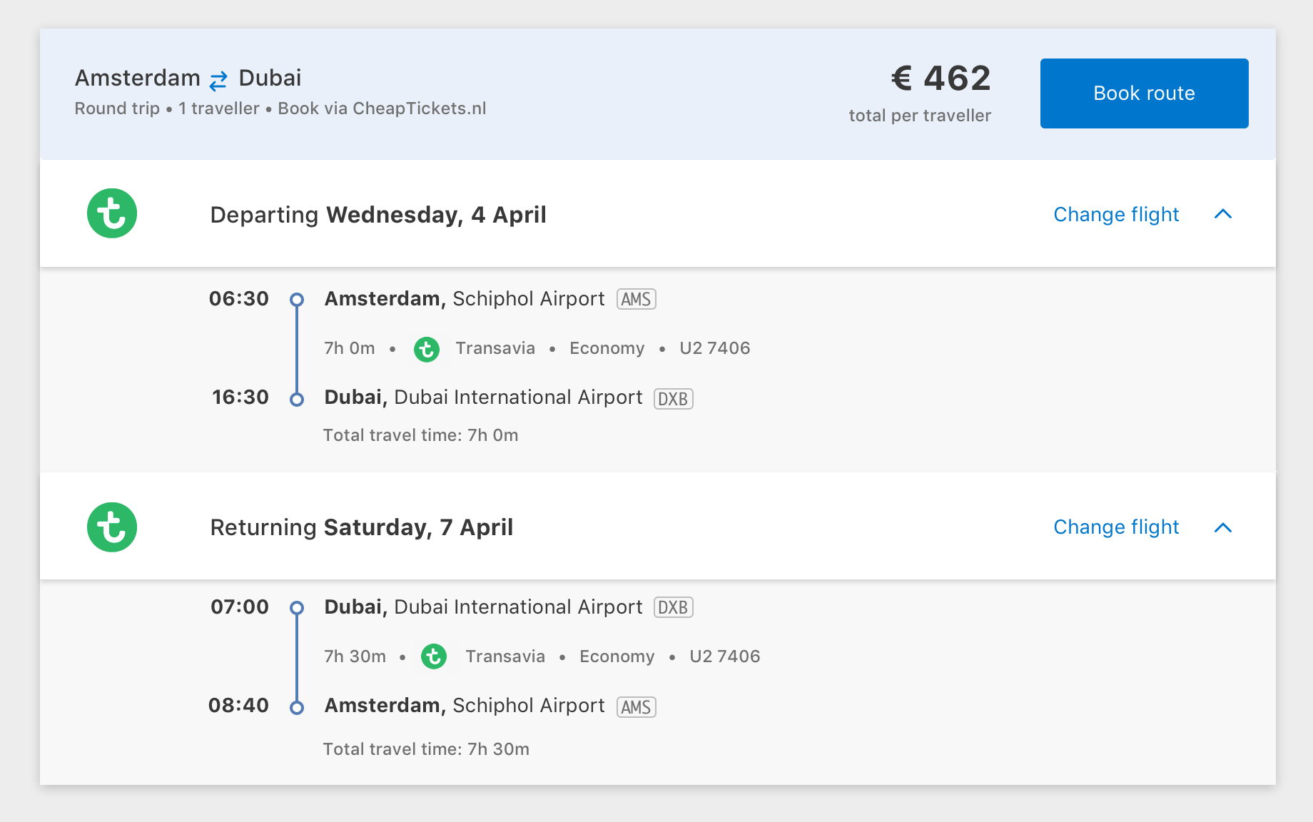
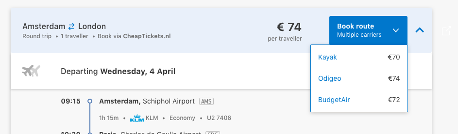
Since we'd be linking to our partners' websites for the users to complete their transactions, we had to make it clear where they'd be heading when they clicked book.
Result
This initial solution has evolved since my time at Booking.com, but some key research insights remain on the flight search results, such as the airport dropdown design, and showing full route flight results.
Working on this project also revealed my own personal biases on how I'd prefer something worked, and forced me to face research that told me it should work differently and question if my own personal biases had creeped into my design. In this project, my personal love of airport codes and building my own trip was not the way that most people preferred to find their flights. Fortunately, through research, testing, and iteration, my bias was filtered out and we built a solution that worked for our customers.
Thanks for stopping by.
© Elena Scherer 2024 · Beaming through the internet to you from Haarlem, Nederland